Edit: it turns out for that the app Freedom that I talk about in this post, the problem is largely to do with Apple’s App Store policies. Their CEO Fred has left a comment below. My apologies! I did end up getting a coupon for my use, and the mistake in their support team refunded me for the price I paid on top of the coupon code. I use the app regularly and find it valuable. It’s worth checking out! But the UI pattern still annoys me so I’ll leave the blog post up. But without this clarification I’m probably being unfair to a pretty good product team.
One user experience pattern I find annoying is coupon codes. Or more specifically: offering me different prices so often that I’m anxious when purchasing that I might not be getting the best price.
See these screenshots from freedom.to:

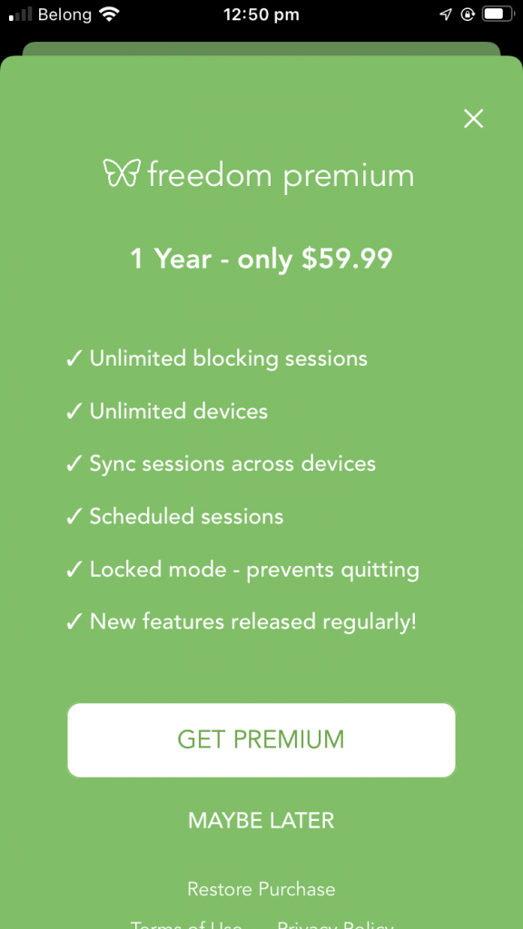
When upgrading from the iOS app 
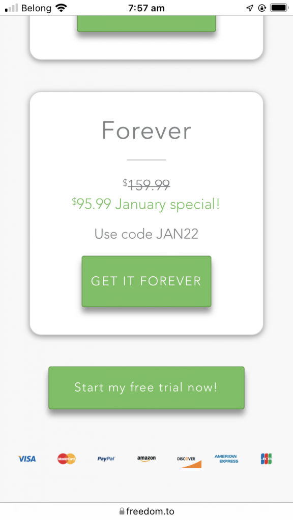
When on the website’s pricing page 
The price of the yearly plan I’m pretty sure I want. $20 less than in-app! 
Viewing the pricing page 5 minutes later, a different discount! 
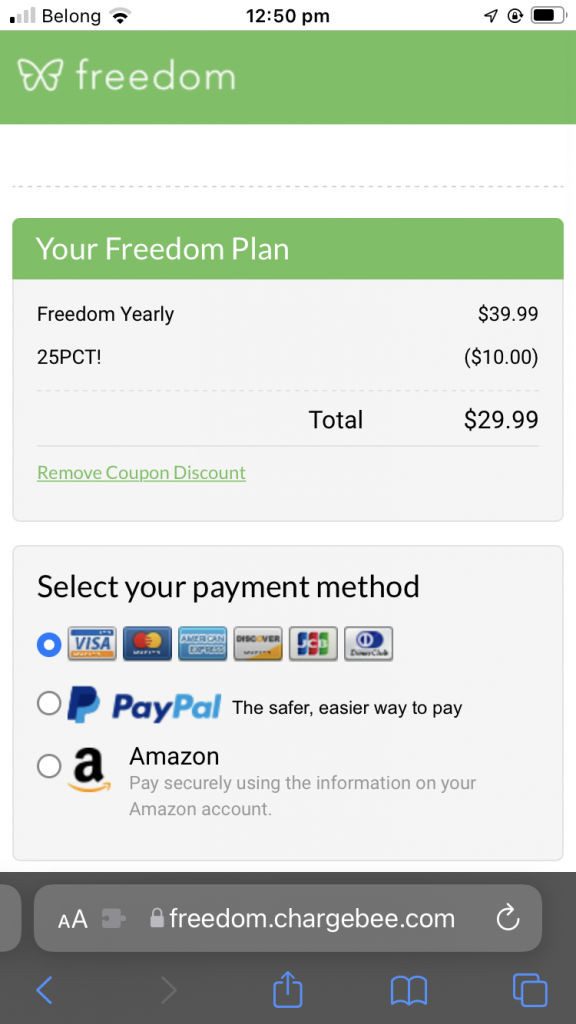
The final price I paid, 50% less than the in-app price
The first price I saw was $60 in the iOS app. The same subscription on the website was 33% cheaper at $40. And there were two separate discount codes. In the end I saw a price for $29.99, which I tried to pay for.
Consistently offering different prices for the same product causes me to lose trust in the company, feel like I’m being cheated, and hesitate to pay, because I’m unsure of if there will be a better price tomorrow.
Frustratingly, I realized after the fact they’ve charged me $39.99. I’ve contacted their support to ask for a refund for the amount the coupon code would have saved me.
Overall, I’m enjoying the product itself – it lets you start a session that blocks distracting websites across all your devices, and does so at a VPN level so that tricks like switching browsers do not work – which is enough to break some of my time wasting habits.
But this saga with the pricing, which was either buggy enough or confusing enough that I ended up paying 33% more than I thought… has left a bad taste in my mouth. I think they must have analytics to prove the revenue benefit of this style of checkout in the short term, but I can’t help but think the brand/reputation damage isn’t going to help long term.