Categories
Blogmarks Culture First Engineering Software Engineering

Endorsing and regretting technical decisions

This post from Jack Lindamood has a format I loved. The decisions and his reflections are interesting, but I think less interesting than the format itself. What I love:

  • You keep track of all the big decisions you’ve made during your tenure in a particular company / role
  • You engage in self reflection on if they were good or bad choices, after you’ve had time and benefit from hindsight
  • You share knowledge with the community (I was exposed to tech I’ve never heard of, and had new takes on tech I use every week)
  • If we had one of these for Culture Amp, it would go a long way to clarifying not just why we use a certain tech, but if we still like it, separate from the decision of if we’re still using it.

At Culture Amp we do use a tech radar that mimic’s the format from Thoughtworks. But the “radar” UI doesn’t lend itself to reading as a whole.

I also like that he’s captured the decisions he’s been accountable for as an engineering leader. That’s fascinating when thinking about recruiting – how do you convince a new company that you’re going to be a leader with good judgement? And how does the new company evaluate if the way you make decisions – and learn from mistakes – is the right fit for them?

(Almost) Every infrastructure decision I endorse or regret after 4 years running infrastructure at a startup · Jack’s home on the web

Categories
Culture First Engineering Front End Development Personal

Li Juen Chang

3 weeks ago I heard the incredibly sad news that my friend Li had passed away. I was his manager for a few years at Culture Amp, and to remember him, I want to share a few stories of conversations we had during out time working together that I think speak to the quality of his character.

Talented, but humble

Li was a remarkable front end engineer. He was quietly productive, building high quality user interfaces faster that almost anyone else around. It wasn’t uncommon to hear feedback that he’d finished building out an entire interface on his own while a whole team of back end engineers were still working on making the data available for it. Eventually people started to notice, and Kevin Yank, our Director of Front End Engineering, asked: how do you do it? Is there some secret the rest of us could learn too?

His answer still makes me laugh. “I’ve got my code editor set up really well.”

To this day I don’t know if he was just trying to deflect the compliment, or if he really thought that was his secret advantage. Tool sharpening is definitely a thing in our industry – we like to quote the proverb “Give me six hours to chop down a tree and I will spend the first four sharpening the axe.”

Li’s editor setup was simple, it wasn’t something he wasted time tweaking over and over, but it was effective. When I watched him work he spent his time thinking about the problem at hand, not trying to remember where a file was saved or trying to remember what a keyboard shortcut was.

Remembering it, I love the humility of his response – he didn’t boast, he wasn’t proud. He knew he was good at what he did, and was happy to share the things he found helpful.

Learning, to share

I remember a point where Culture Amp had just acquired a smaller company, and we were looking for some senior engineers to transfer in and join the team we’d just acquired to help them integrate their product into ours.

At first Li was interested in exploring the opportunity, but then backed out when he realized the move would be permanent, not a secondment from his current team.

We had some conversations to explore the opportunity, and he surprised me with his biggest motivation not being the desire for a lead role, or a high visibility project, or the desire to work with a team based in the US, but instead the chance for mutual learning. He wanted to work with an established team, see what he could learn from them, see what he could teach them, and bring that back to his existing team and work, sharing what he had learned. Which explained why he was interested if it was a secondment, but not permanent.

Throughout our time working together I was always impressed at his willingness to learn, be curious, do deep dives into a problem, and then to bring what he’d learned and share it back to the team around him so we would all benefit.

Contentment

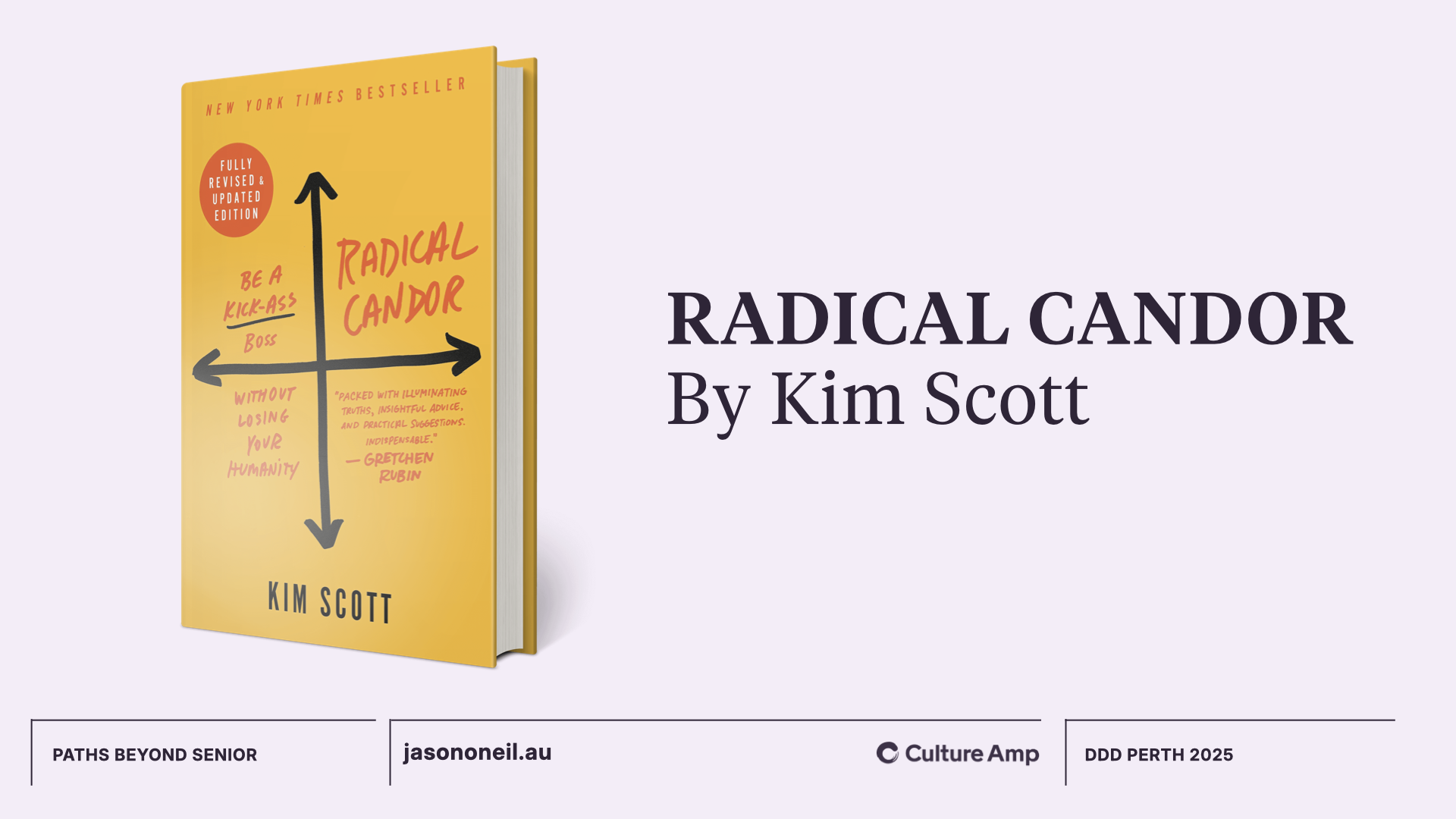
I remember wanting to understand some of Li’s long term career aspirations, and I asked a question I learned from Kim Scott’s book Radical Candor: “At the peak of your career, what sort of work do you want to be doing?”

Most people have a few different answers to this, sometimes its a job title (“director of X”) or a specific role (“I want to be focused in Application Security”) or an ambition outside the industry entirely (“I want to run a small business, maybe a food truck”) or a personal goal (“financial independence, then volunteering”).

It was hard to get a picture from Li of a specific goal he was working towards, and the reason I eventually learned, is that he was content. He really liked the kind of work he did, and found it meaningful. He really liked the people he worked with. “I’m actually really happy in my current role” was something he’d say if I kept asking.

Contentment is rare. Especially in the high-growth software industry. When I think about Li’s good-hearted approach to work and life and his ability to actually enjoy the place he’s at, without longing for more, I think of this quote from the bible:

godliness with contentment is great gain.

Li found contentment, and I admire him for it.


There was a whole lot more about Li I never got to know that well – perhaps because of the manager/employee relationship dynamics, perhaps because we worked from different cities, we didn’t share much of our personal worlds with each other. There was a little bit – I’d hear about an upcoming dance congress he was excited about. Or how a lunch we shared reminded him of Sunday lunches after church with his family when he was growing up. Or about the ups and downs of buying, owning, renting out, and selling an apartment. I had no idea he could speak Spanish. I wish I’d had more time with him, and asked more questions, and shared more of myself too. But even without that, I’m grateful for having crossed paths, worked with, learned and laughed together.

I’ll miss you friend.

Categories
Culture First Engineering

Adapt your facilitation skills for video meetings [remote work inspiration]

Hi 👋 I’m Jason. I’ve been a remote worker since 2016. Full time remote since 2017, and managing a team remotely since 2018. With people across the world suddenly finding both themselves and their teams homebound, I thought it might be a good opportunity to share some of the things I’ve found helpful as a remote team lead. I work at Culture Amp, a software platform that helps organisations take action to develop their people and their culture. We have a collection of “inspirations” – ideas you can copy in your organisation to improve its culture. I’ve followed the basic format here.

Facilitating good meetings requires having a bunch of tools in the toolkit to make sure everyone gets a chance to speak, people are understood, and it is a valuable use of people’s time. The tools you’ll use for video meetings are slightly different, so it’s worth getting familiar with them.

Why?

Video meetings present slightly different challenges: there can be poor connection quality, non-verbal communication is limited, it’s more likely people will attempt to multitask, and less likely you’ll know if they are, and there’s no obvious “clockwise” direction to go around the room when seeking everyone’s input.

Instructions:

Here are some tools to add to your toolkit:
  • Recreate “going around the room” to let everyone have a chance to share. You can do this by having the first person to share choose who goes next. As each person shares, they choose who goes after them. This is a good technique for “stand-ups” and other similar status update meetings.
  • Use hand gestures to signify you would like to speak next. Because of the slight delay on video calls, when multiple people want to speak up it’s hard to not speak over each other. Rather than wait for a gap in conversation and jump in, signify you would like to speak next by raising your hand with one finger up – you’re first in line to speak. If a second person also wants to speak, they can raise their hand with two fingers up. Usually a group learns this system quickly but it’s important the facilitator respects the order.
  • If people have noisy surroundings, ask them to mute unless speaking. If someone on the call is in an open plan office, is working from a cafe, has children nearby or even noisy animals outside, these can all make it harder to hear the person speaking. Encouraging people to mute by default makes it easier for everyone to hear.
  • Encourage everyone to have video turned on. It helps with non-verbal communication, and for someone speaking to see if they are being understood. Exaggerated head nodding, thumbs up, and silent clapping are all great ways to give feedback even while muted, but only work if the video is turned on. Exceptions can be made if the connection quality is poor, or if it is a presentation rather than a meeting.
  • Consider screen sharing a document that serves as both the agenda and the minutes, and editing it live. Adding a visual medium alongside the conversation helps participants keep focused and can give extra context. Taking notes and recording actions in the moment is a great way to ensure people are aligned and there aren’t misunderstandings.
  • Be conscious of how screen-sharing impacts non-verbal communication. Often when you start screen sharing, the other participant’s screen is now dominated by the screen share, and the faces of their colleagues are reduced to thumbnail size. This reduces the bandwidth of non-verbal communication like facial gestures and body language, and can make it easier to have your tone misinterpreted. For sensitive conversations, consider turning screen sharing off.

    If you have a dual monitor setup, some products like Zoom have settings that allow the screen sharing to take up one full screen while still seeing participant faces in full size on the other screen. This is worth setting up if you can!
  • Use “speedy meetings” to allow time for breathing and bathroom breaks. When someone has back-to-back meetings in an office, they usually have breathing space as they move from one room to another or wait for the next group to arrive. When video calls are scheduled back-to-back the calendar can be a cruel task-master. Scheduling you meetings to run for 25 or 50 minutes (rather than 30 or 60) gives everyone a chance to breathe and can drastically reduce the stressfulness of a day. Important: if you schedule a speedy meeting, respect everyone by finishing on time.
  • Make space for “water cooler” talk on the agenda. Make sure the first five minutes or last five minutes of the meeting have space for the people to chat casually and catch up. In an office this often happens on the way to a meeting room, or on the way out, or around an actual water cooler. When it’s a video call, you have to be more deliberate. Make sure the agenda leaves enough space for this, and start a conversation that’s not just about work.
Categories
Culture First Engineering

Video hangouts with no agenda [remote work inspiration]

Hi 👋 I’m Jason. I’ve been a remote worker since 2016. Full time remote since 2017, and managing a team remotely since 2018. With people across the world suddenly finding both themselves and their teams homebound, I thought it might be a good opportunity to share some of the things I’ve found helpful as a remote team lead. I work at Culture Amp, a software platform that helps organisations take action to develop their people and their culture. We have a collection of “inspirations” – ideas you can copy in your organisation to improve its culture. I’ve followed the basic format here.

Basic idea:
Book in recurring video “hangouts” where a group of people have a chance to catch up with no set agenda.

Examples:
  • A team “wind down” each Friday afternoon.
  • A monthly “remote workers lunch”.
  • A fortnightly “engineer hangout” for engineers from across the organisation.
These hangouts should be optional to attend.

Why?

When teams aren’t in the same physical location, a common trap is only talking to people during set meeting times, and to only talk about the current project. Having a time to chat about anything, whether or not it’s work related – like you might in an office lunch room – is a chance to build better relationships and foster a sense of belonging.

Instructions:

  • Pick a group of people who would benefit from a stronger sense of community and belonging. It might be a team, a demographic, or a group with a particular role.
  • Find the appetite for how often people would like to meet, and for how long. In general, a range between once a week and once a month works for most groups, meeting more often the more important the relationships are. Meeting times can vary between 30 minutes and 2 hours, depending on how much of a “drop in / drop out” vibe you want.
  • Schedule a time! Try to find a time that is unlikely to be interrupted by other meetings, and unlikely to be highly focused time. Make sure it is within regular office hours to show that you value this type of connection enough to dedicate company time to it. For some groups it may be appropriate to book over lunch
  • Send an invite! Make sure attendance is optional.
  • During the hangout:
    • As the facilitator, make sure you’re online the entire time.
    • Greet people as they join, and introduce people who might not know each other.
    • It’s okay if people talk about work. It’s okay if people talk about life outside of work. It’s okay if people don’t talk and seem to be doing work on their laptops. 
    • Ensure there is only one conversation going on at a time. If people want to start a splinter-conversation, they can start a separate video call.
Categories
Culture First Engineering

Design systems and team culture

Slide: Design Systems & Team Culture. Jason O'Neil @jasonaoneil

Design Systems and Team Culture

This week at the UX Perth meetup I shared this talk about the human side of building design systems – how your team culture affects the design system you are building, and how the design system can affect the team culture you are building.

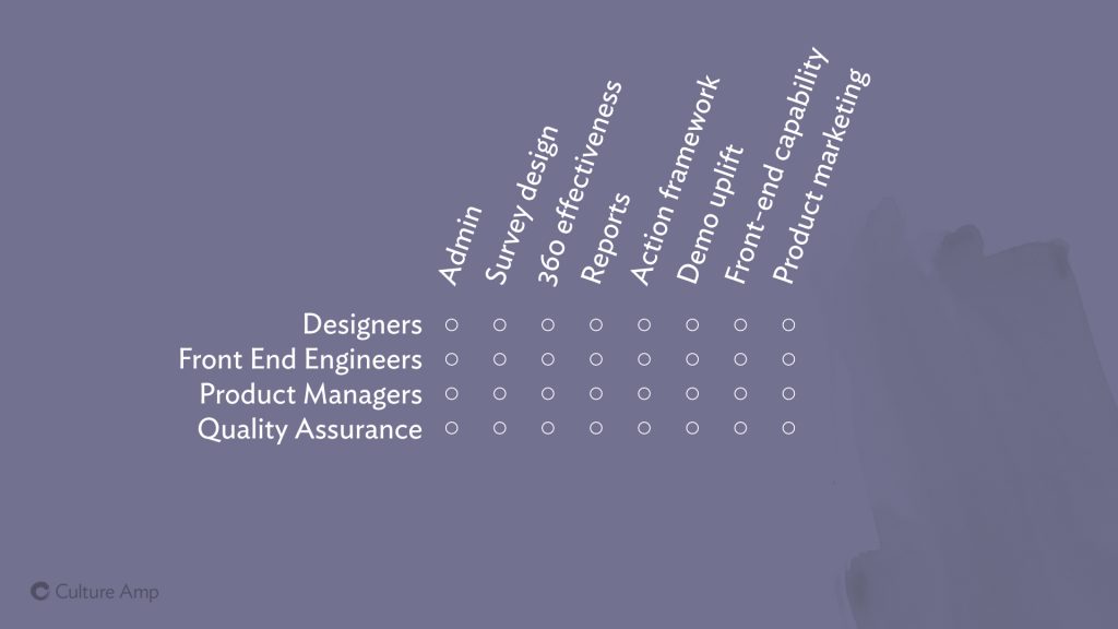
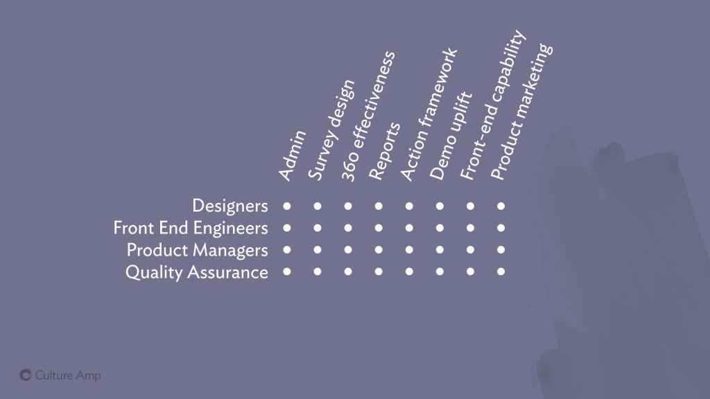
Slide: The diagram illustrating the cross-functional team-of-team's structure at Culture Amp - we have many teams, each with their own designers, front end engineers, back end engineers, product managers, testers, etc

At Culture Amp, we operate on a “team of teams” model. We currently have about 200 staff, with about half of those contributing to the product as engineers, designers, product managers, QAs etc. Each product feature has a team responsible for it, and this team is “cross-functional” – so rather than a single infrastructure team, each team should have its own infrastructure specialist. Rather than there being a single design team, each team should have a designer.

The idea is that each team should be able to move to its own priorities without being blocked by other teams. But as you can imagine, this can lead to people being out of sync.

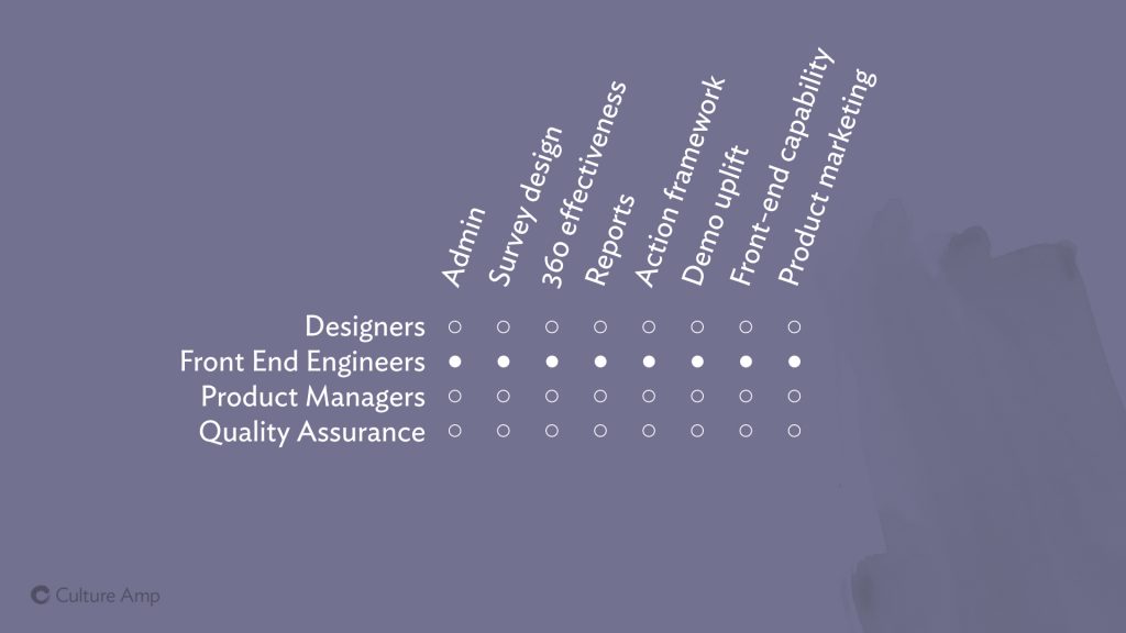
Slide: The diagram illustrating the cross-functional team-of-team's structure at Culture Amp, with the front end engineers from across all teams highlighted.

Designers on different teams might be making simultaneous decisions about the styling of a button, and reach two different conclusions, resulting in two button styles.

In other disciplines, like Front End Engineering, you have people from across different teams working on different products with different code-styles (and even different languages!) How do we make sure that people on different teams can produce work that is consistent, high quality, fast to build and easy to maintain?

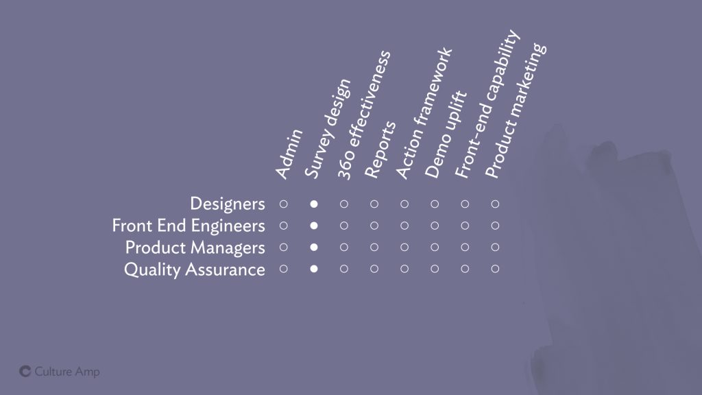
Slide: The diagram illustrating the cross-functional team-of-team's structure at Culture Amp, with the Survey Design team highlighted.

And then within a team, how can we make sure designers, engineers, product managers and everyone else is speaking the same language, and making decisions from the same framework?

Can we avoid designers saying things like “Use Ideal Sans, size 12px, line height 18px, all caps, and maybe some tighter letter-spacing?” and instead say “Use the Label style”.

Establishing sensible defaults, and giving names to them, enables your team members to talk to each other with less confusion and ambiguity – and that clear communication helps lead to less mistakes and faster work. It also helps product managers know which styles already exist and can be used, and which ones the team needs to invest in creating from scratch.

Slide: The diagram illustrating the cross-functional team-of-team's structure at Culture Amp, with everyone on every team highlighted.

Across the business, we want to align everyone, so that our product looks and feels consistent, no matter which team built it. And we want to speed up people in all roles on all teams, so that they can spend less effort recreating yet-another-button-component, and focus more on delivering real features that benefit our customers.

This is where design systems really shine: they give a common language that designers, PMs and engineers can use to all be on the same page. They help bring consistency in fonts, colors, styles and components to people on different teams who don’t interact often. And they give us a platform to build common, re-usable designs that can be shared across teams, enabling all the teams to build things faster and with more consistency.

How our company values interplay with our style guide efforts

So building a design system was the right call for us at Culture Amp. But how does that play out with the actual people, each with a specific role on a specific team? How does it affect our approach to work, and more importantly, to team work? How does the design system interplay with our team culture?

At Culture Amp we spend a lot of time talking about our company values, because our aim is to be “Culture First“, to focus on having an amazing work culture, working and living according to a shared set of values, and to let achievement and success arise from that culture.

So we have four values:

  1. Have the courage to be vulnerable
  2. Trust people to make decisions
  3. Learn faster through feedback
  4. Amplify others

How do these values impact our implementation of the design system? And how does our design system feed back into these values? Let’s take a look.

Slide: Value #2 Trust others to make decisions

Trusting people to make decisions can be hard. There is a reason micro-managing is such a problem in so many workplaces. And when it comes to design systems, you often hear companies talk about introducing them precisely because they don’t trust people to make decisions. They don’t trust them to use the logo correctly, they don’t trust them to choose an appropriate header type style – so they codify the “correct” way in the style guide and make sure everyone follows it.

Dictatorial decision making doesn’t leave any space for creativity and innovation. I personally believe the most inventive things happen on the edge of a group – not in the center – and you don’t want to squash that by rigid enforcement of a system that takes away a team member’s ability to make a decision.

But more importantly – if you remove all freedom from your team, limiting the ability of your designers to design, and of your engineers to engineer better components, never allowing them to build anything new and better – they’re going to resent it, they won’t enjoy their jobs, and you won’t see their best work – their talents will be wasted.

So how do we balance the desire for consistency with the desire for freedom? Let’s take a look at some examples.

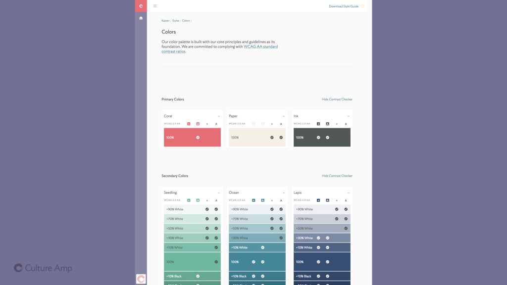
Slide: a screenshot of the color palette page used at Culture Amp
We ask everyone to trust us and stick to the palette. Meanwhile we trust them to make good decisions with how to use that palette, and don’t try to micro-manage through design reviews.

With our brand colors, we have a predefined palette of 3 primary colors (“Coral”, “Paper” and “Ink”), 6 secondary colors (“Ocean”, “Seedling”, “Wisteria”, “Yuzu”, “Lapis” and “Peach”) as well as a small number of tertiary special use colors. These base colors were decided on by designers from across the organisation coming together – it wasn’t an edict from on-high, it was a collaborative effort to unearth the color patterns already in use, and choose and standardise on those that most identified with our brand.

From those colors, we tint them (add white) and shade them (add black) to come up with nearly 300 variations you can use and still be on brand.

(Read more about that in my post How a design system can encourage accessible, on-brand colors.)

With defining this palette, the designers are asking us to trust them – for any text or button or border on the site, we should be able to use one of these colors.

And trust is a two way street.

In return, they can trust us engineers to make sensible choices within the palette. I know the system suggests we use “Ocean” blue for links, and I can choose the appropriate shade of Ocean depending on accessibility requirements, and make the decision myself, without needing to consult a designer.

We trust them to define a palette, they trust us to use it wisely.

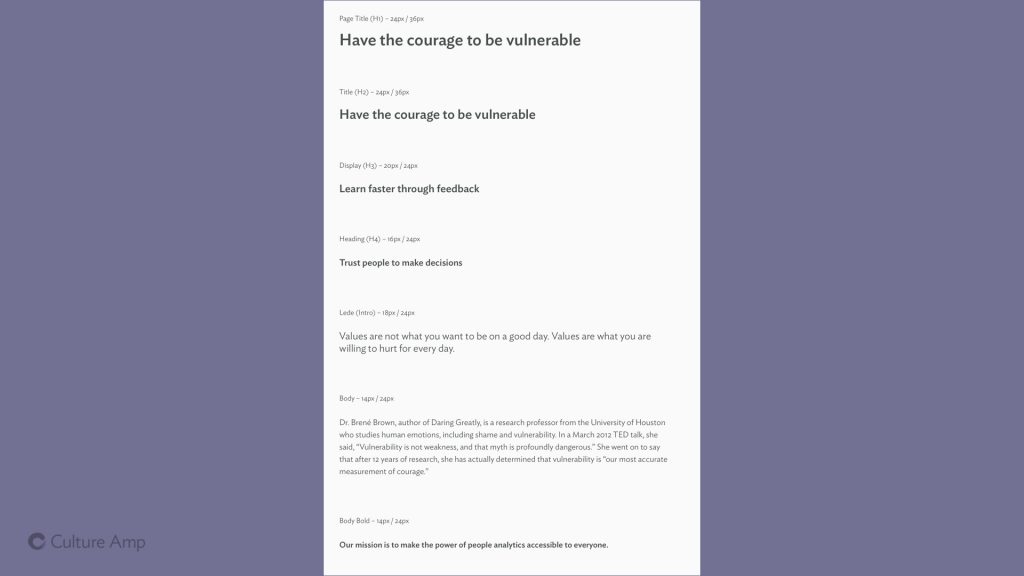
A screenshot of the type styles used at Culture Amp
We ask people to trust us and stick to these type styles wherever possible. We trust them if they say they need to deviate.

We did a similar thing for type styles, defining a range of headers, paragraph styles, labels and more that could cover most of the usages on a page. (Click here to see our type styles).

While I was giving this talk on Tuesday night I had Slack messages coming in from designers and product managers on one team talking to designers and product managers from our team – how much freedom would their team have to do what they needed for the visualisation they were designing – would they be free to explore or would they be limited to only a small palette of avialable styles?

Again, it comes down to trust. Those building the design system need to trust teams to know when and how to use it, and to know when to step outside it and try something new. If you trust that they share the same goal of great design and consistent design, then you can trust them to make the right call about when to experiment outside of the system. The work this team does may well bubble back up into the design system and become a standard for other teams to share.

Slide: Value #1 Have the courage to be vulnerable

One of our other values is “Have the courage to be vulnerable”.

(If you have not watched Brené Brown’s exceptional Ted Talk “The power of vulnerability”, you should do so now).

One way this shows up in building a design system is fighting any tendancy towards perfectionism, which is common for many designers and engineers – we want it to be perfect before we share it with the world. We want it to be just right before other teams start using it.

But sometimes sharing it early, even when you still aren’t proud of it yet, or are maybe even ashamed of how it looks or how it’s built, is still a good thing, and can help someone else, even in the early and rough state.

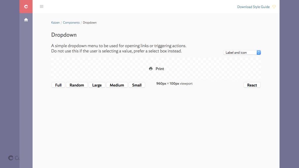
Slide: a screenshot from our style guide showing a dropdown component demo, but the demo user interface has ugly buttons, select boxes, and weird font weights.
We have a really great mock-up for our design system website with a very pretty way to demo components. But we have to be okay with sharing the ugly version so people can start using it now.

This showed up with launching our design system website, www.cultureamp.design. Parts of it look nice, but no where near as nice as the mock ups. There are designs so beautiful and so on-brand that we really wanted to share them with the world. But perfect can be the enemy of good, and at the end of the day, we had to share this with out team rather than keep it a private secret. We got over our insecurity, and started sharing it, and people have found it useful, even if there’s so much we wish we could improve.

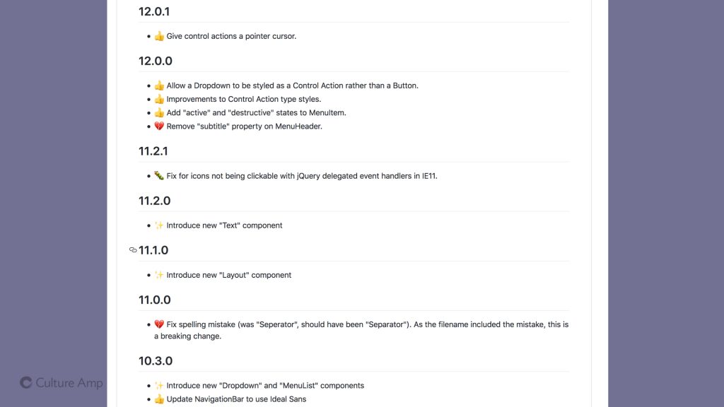
A screenshot of our changelog including many small changes, some of them breaking changes
Moving fast and not waiting for perfection means making mistakes, like me needing to make a breaking API change because of a spelling mistake.

This has applied to the components we build as well as the website we use to showcase them. In the interest of moving faster and being less precious, I got excited and shipped a new dropdown component, including the ability to add a “seperator” to the menu. Not a “separator”. Yes I shipped a version of our design system with a spelling mistake, and fixing that was a breaking change, immortalised forever as a version bump in our CHANGELOG.

Putting yourself out there isn’t only about sharing your work early. It’s also about opening up the possibility for them to criticise the work you’ve done. Sometimes asking for feedback gives you feedback you didn’t want to hear.

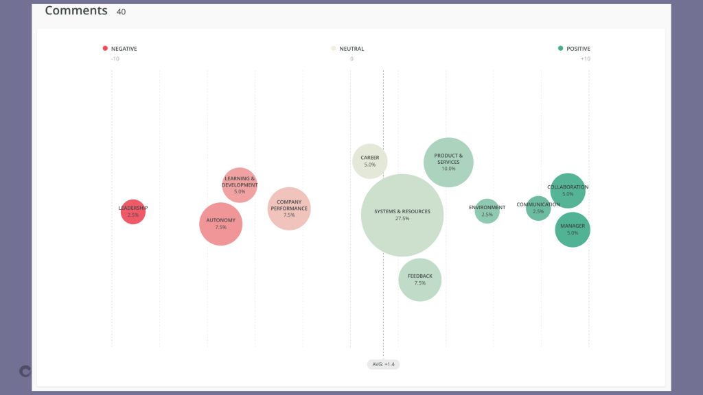
We did this when our team, who are the main drivers of the design system, asked designers and front-end engineers from across the company for feedback on how we’re going.

Slide: a bubble-chart visualisation showing the number of positive and negative comments about some topics related to our team
A visualization of the comments we received when we asked for feedback on how our team was going

Often we talk about user experience and user centered design, but with design systems, we have two classes of users: the end users of our product, and our colleagues who use the design system to build the product. Taking the time to listen to this second group, our colleagues and team-mates, is crucial.

And it ties into one of our other company values: Learn faster through feedback.

Slide: Value #3 Learn faster through feedback

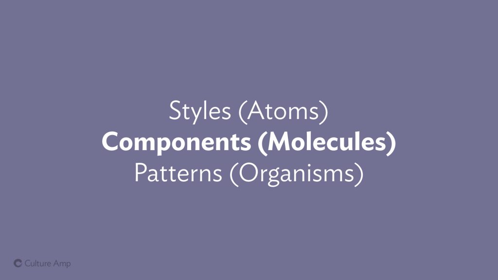
One key thing we learned through this survey was that we’d been over-investing in the base level styles (typography, color, icons) and underinvesting in the mid-level components (for example drop down menus, tabs, and select boxes).

Slide: Styles (atoms), Components (Molecules) Patterns (Organisms). Components is in bold.
We spent all our time on Styles, but the feedback showed we would be more helpful if we built more ready-to-use components.

Our team had been focusing on bringing consistency at the low level – changing typefaces and background colors and icons across the app, which was an enormous amount of effort on our part. But what would have helped the other teams more is if we built components that helped them deliver their designs faster. It might mean it would take longer to bring consistency to some of these fundamental styles, but it would mean that these teams are delivering valuable features to customers sooner.

That message came through our survey, loud and clear.

And at the end of the day, that ties into our fourth value:

Slide: Value #4 Amplify Others

Amplifying others. That’s the reason we’re building a design system in the first place – it allows us to amplify each of the product teams in our company, allowing them to move faster, stay in sync, spend less time sweating the fine details – and deliver a higher quality and more consistent experience to our customers.

That’s what it’s all about – and if we keep this in mind while we build out our system, it can help keep the work grounded, practical, and more likely to make an impact.

It isn’t about having the prettiest showcase of components. It isn’t about the elegance of your solutions, or the way you ship new components to your teams. At the end of the day, it’s about the people in your teams, and how you can amplify them, so they can build better products, faster, and with less stress.

And if amplifying your workmates does not motivate you, then you might have bigger team culture issues that a design system is not going to fix!

Have any questions? Feedback? Other observations on how team culture and design systems interplay? I’d love to hear them!